Showing posts with label multimedia. Show all posts

Thursday, June 11, 2009

Politico44

I have never seen a "living diary" of a presidency before. But after observing Politico44 for awhile, I see that it is a fair attempt but it's very brief.

If you are looking for a quick "overview" of some highlights throughout President Obama and his administration's day, this may be a resource.

My impression of a 'diary' is a personal log and analysis of person's day-to-day life. I see that the Obama Presidency takes on this personification. And the result is pretty text heavy and not enough video!

To speculate on what it TAKES to run this site, I would gather, that the Politico staff assigned people to update the sections. The Whiteboard section is clearly the DOMINANT feature that provides highlights throughout the day. So here are my thoughts:

1. Someone must be providing these updates on the WhiteBoard almost EVERY hour.

2. Someone or a machine automatically updates the "schedule" of the President and VP daily.

3. Someone looks at other political stories online and selects the ones to be highlighted on Politico44. I saw yesterday, there were article from The Washington Post and AP linked to the site.

4. Another part of the news site is devoted to VIDEO. Politco44 provides this VIDEO link along with a highlighted clip. I looked at the video section and really liked the short clip of Colbert and President Obama talking. Colbert gets his head shaved!

5. I appreciate the "W.H. Hopes You Don't See" section. It actually makes me want to read those posts more.

6. I don't like how I don't see a clear coherent template. The site actually builds more postings or reduces postings according to the schedule of the day. This flexibility is good. But who is making the call on what is going to be pushed more ABOVE on the site?

7. There are some consistent authors: Carol E. Lee. Others are Politico bloggers: Ben Smith.

8. So, I am seeing that other parts of Politico.com gets compiled and excerpted to make up a good portion of Politico44.

9. I am taking a guess: There are about 2 Politico staffers devoted full-time to this site.

What do you think???

Wednesday, June 10, 2009

So Good, It's Bad

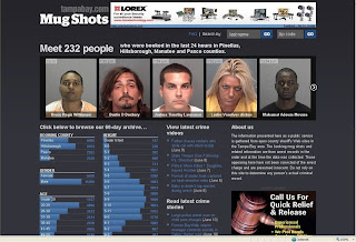
This multimedia effort is so successful, and yet it's so ethically questionable. The St. Petersburg Times' online staff of Tampabay.com, created a website with a computer program that searches and compiles the mugshots of everyone arrested and booked in the Tampa Bay area's four counties: Pinellas, Hillsborough, Manatee and Pasco.


The completely automated computer program searches the database of each county's sheriff's website and puts up the profiles of those arrested in the last 24 hours. The data is also broken down by gender, height, weight, age, and eye color. Crime articles and videos also populate the site.

The site says it is a public service website that helps those to search and "meet" those arrested by last name and zip code.

The Poynter Institute held an online chat with the programmer behind this site, Matt Waite. They discussed some big ethical concerns. (Scroll down to the online chat transcript.)

In the chat, the public had a concern with Google's ability to pick up these mug shots. Waite insisted that they took pains to keep Google away from this site. And also, after 60 days, the photos of these individuals would be flushed out from the site. Except, the records of one county goes back to 1995.

From a multimedia standpoint, this website is VERY successful. The individual county sheriff's sites have very old-fashioned, boring looking designs. Also, nothing is streamlined. One county's "arrests inquiry" is the same as another's "who is in jail" section.

Also, I can't help but look at the faces of these people. Waite says that only those files with mugshots get to be placed on the site.

However, from an ethical standpoint, these people are being wrongfully associated with crime in these four counties. Just because they are arrested, it does not mean they are guilty. The site states this fact in its "about us" section. However, I can't help but wonder how many people would look at these mugshots and NOT think: CRIMINAL.

Also, the statistics of gender, age, height create a visual representation: it gives the impression that these statistics are representative of ALL those arrested in the four counties. However, that is false. Some individuals with faulty mugshots or no image are NOT placed on the website.

Waite says in the Poynter chat that this project was spawned from his paper noticing that there was more online traffic on crime stories containing a mugshot.

There's a "Facebook" feel to the website. It's very visually clean and modern. However, to me, it's not a public service. To me, the site feeds on the public's curiosity and facination with the mugshots.

Monday, May 25, 2009

Loving These Multimedia Websites


I enjoy these multimedia websites because they are fun, organized, and easy-to-use.

1. Feast Your Eyes On This!

If I had a website, I would model it after this one! I LOVE the music. It totally gives the ambience/vibe/mood of the personal chef. The music makes me feel that she's sophisticated like a nice, intimate high-end restaurant. And because I like the music so much, I am inclined to spend more time exploring the site. Also, I am happy that the music can be stopped at any time, just in case a visitor doesn't want the music on.


Her Recipes page is interactive/fun and visual. You click on the recipe box and the individual recipe page "pops out." I think the images are beautiful, neat, and clean. I actually contacted the personal chef, Tianna Feaster, to ask who built her website. I got the name of the guy and saw that he is an extremely creative online website builder. It seems he not only knows the technical stuff, but he also knows web design and visuals. This is why I love this website.


I also like the highly personalized language used with the site. Instead of just "contact" or the usual words, she uses "hit me up!" as her label for the "contact" page. I can read her personality through these choice of words.


The ONE caveat: Before you get into the main web page, there is a page that specifies what types of software and computer would be required/best suited to view the site. This may be the extra step you have to take with such a highly designed website.

Required:
-Java Enabled
-Flash Player Plugin

Best viewed with:

-High Screen resolution
-Broadband Connection
-Speakers
-Internet Explorer 7.0
-Firefox 2.0


2. The Wall Street Journal video section

I enjoy this news website's video player the BEST out of all the other news video players. I like how the video window is a reasonably large size. (The Pop-out video size is also fairly reasonable. But I don't use the pop-out video size that much.)

I would LOVE for the video player to be even bigger like on Youtube, but compared to other news video sites, this is a really good one. The resolution is also pretty good. Also, the video player doesn't DRAG or have glitches from the times I've visited the site.

I usually HATE the video commercials. But somehow, I don't mind the ones on the Wall Street Journal video player. I think it's because these web video commercials are highly produced and creative with really good MUSIC. Again, I come back to music because that's what draws me in. Visuals are great but you can't deny noticing the sounds.


Also, it's clever that between videos, the player displays a 5 second "The Wall Street Journal" mini-ad. It's just a simple piano tune along with the words, "The Wall Street Journal" pieced together from white scattered white puzzle-like pieces. The repetition of this tune and the ad is very effective between news pieces. (I can't get the tune out of my head.)

The enjoy browsing through the video clips. There's an eclectic mix of news topics all put at the bottom of the video screen. Also, I like the video title and concise news caption for each video.

I work in TV news. So I think the Wall Street Journal video reporters often lack the energy in their voices. This is one thing I wish they would do better--- sound more enthusiastic.

3. Google.com


I use Google's search page every time I go on the internet. I appreciate that despite all of the multimedia features that Google has developed (images, video, maps, shopping,) the search page remains relatively simple and clutter-free. I am a HUGE fan of this minimalist style and hopes it remains this way.