Friday, October 2, 2009

My New DO!


Ok, it's been awhile since my last post. In a Nutshell: Our class is done and I got an A in it! Woohoo!


I also went to Shanghai, China for ten days. It was for a sad reason, my grandpa passed away. But he lived a really fulfilling life and for that, I am so grateful for all the times I've gotten to talk with him on the phone and spend that quality time with him in Dec. 08.


The last conversation we had was on the phone before I left for a business trip to Boston. He sounded really happy for all the things going on in my life. We ended the call on such a high note!


He left his memoir...a body of work I sorta pushed for him to start. I want to translate it.


Anyways....What do you think about my new do?


Thursday, August 13, 2009

AAJA Convention 2009


I attended AAJA 2009 Convention in Boston. This was my first time at the Asian American Journalism Convention.


I recruited, held a workshop on how to build a website using online tools, and sang and danced!
The economy may be bleak but it didn't stop convention-goers from partying it up!


Good times!


Friday, July 10, 2009

Web Redesign: Inspector General of the Interior


Here are seven questions and answers to redesigning the website for the Inspector General of the U.S. Dept of the Interior.

It needs a face lift...badly.

1. Who is our target audience (hint: Don't try to be all things to all people)


1st - Media and Congress are the main focus.

2nd- Still, the general public, taxpayers are the ultimate reach. By pushing the newly designed IG website to the media and Congress, it is hoped that the work accomplished by the IG of the Interior will be reported more often.

2. What is the competitive landscape? (hint: Sites that do it well)

GAO does it better. Their IG webpage is under their main homepage. They have well- defined lists of recent reports. Also, GAO has presence on Twitter. There are also links designated for Congress and Media.

3. How do we differentiate ourselves? (hint: Secret sauce)

The mission of the redesign is to showcase the office's reports and investigations within a multimedia framework.

Pictures and video material will be attached to the reports. Katy has indicated that the office already uses photos and video in its investigations. However, these materials are not being put on the web at the moment. We will put these element on the website.

The website will be more interactive with a map of the US highlighting "high profile" investigations by the office. There will be a small map icon on the main front page that would lead to a full page featuring the interactive map.

4. How do we create our site? (hint: Staff and schedule)

Designate two core web editors who write brief summaries of the reports. They will also populate and organize the website.

Public Relations person will Twitter information about the latest reports.

IT person will execute the act of putting new items on the website.

Katy has said there is an independent contractor already hired to redesign the site. This contractor will create the web template that others can implement.

5. How do we get our content? (hint: Pre-built, manual, automatic, updated)

Content will be collected from the office's investigations, audits, evaluations, inspections and assessments.

Many of these, already conducted by IG employees, have video and still pictures as part of their reports. These investigators already are use to doing two versions of their reports – a "redacted" version and one for internal files.

The website will use the "redacted" version of the reports.

6. How do we market our site? (hint: Spread the word)

A. Get a list of media outlets and have PR person send e-mail alerts on the latest IG office reports. Send out weekly press releases highlighting any visuals.

The PR person will send an email with two web links:
1. the web link related to the specific topic relevant to the media contact.
2. the main website address

B. Twitter, Facebook, YouTube will be utilized in a similar fashion to the GAO office.

C. Katy says there is an existing campaign marketing the IG Interior's complaint hotline. The campaign will be updated to include the website address.

D. Link our website to www.recovery.gov. And include our website on www.recovery.gov's site.

E. Change the website address to InteriorIG.gov – easier to market than the current: http://www.doioig.com/ – (dept of interior office of inspector general).

7. How do we sustain the site? (hint: Show me the $$$)

Funds would be doled out via Federal appropriations and employees already on the payroll. President Obama has said he wants to make the federal government more transparent and interactive on the web. Revamping this website would be at par with the President's mission.

Sunday, July 5, 2009

What I've Learned About Hatching The Idea


So after listening to Cynthia Farrar, creator of PurpleStates.tv, I have gathered some conclusions about the elevator pitch.

I think the biggest thing I've taken away from the presentation is that you have to gather people who can generate momentum, excitement and the know-how to get the idea off the ground in a specific window of time. I think generally, that window of time is rather SMALL. So you have to work quickly.

I think if you let the idea brew for too long, there will be ample amount of people who would have the time to bring up criticism and drawbacks related to the idea. This will significantly impact the idea's prospects of becoming a reality. Don't let them knock down the idea even if it IS a "straw man" at this beginning stage.

So, I take to heart that with any idea, one must find supporters and those who "get it" as soon as possible. These people's belief in the idea will help keep discouragement at bay and be a motivator for the creator.

Oh....and here is my "Spoons" elevator pitch:

"Spoons" is a site offering fun ways to cook simple meals designed for the novice cook. Cooks at the beginner's level are often intimidated and don't know where to start honing their skills. This website will offer simple how-to videos and easy recipes. Moreover, the website will provide a meeting place for all culinary lovers. People will build a network of their own culinary friends to share recipes, advice and pictures about their experiences in the kitchen.

What makes the website stand out is that all the recipes incorporate the use of a set of color-coded measuring utensils. These utensils may be ordered and given out for free in the first year of of the website's launch. Kitchen ware companies may sponsor these spoons.

There's a saying that to understand another person, one must "break bread" with him or her. Well, with "Spoons," each person lands a spot at the virtual dinner table.


Thursday, June 25, 2009

Fine-tuning Spoons: Elizabeth Jia's Idea


Cooking for Rookies

QUESTIONS and ANSWERS:

1. How do you connect the three distinct parts? Videos/spoons/social networking?

The three parts would be integrated. There would be a video section on the website. The social-networking component is integrated into the entire website. Users log into the site in order to friend others, download recipes, and share their culinary experiences.

The spoons are the TANGIBLE aspect of the entire project. The spoons should be ordered/purchased via the website OR gotten through a promotional event (festival, weekend event..etc.)


2.Instructional cooking videos are hard to pull off. Especially for user generated content because of lighting etc.

The videos would be produced by the website staff AND any willing sponsors.

Producing all those spoons will be difficult-- who will pay for them? Will they be donated? Shipping and hand?

The spoons will be designed and produced by a utensil/kitchen ware company. Shipping and handling would be handled via the start-up funds of the website. Also, the promote the website, the initial stages of handing out the spoons will rely heavily on local events where "street teams" would be deployed to hand out the spoons.

Will people want to give their addresses out to you so you can send them the spoons?

People may feel safe if the website uses a safe/secure site like Paypal.

3. Ads on the videos would bring in money to pay for spoons and maybe sell logos on the spoons to companies to pay for the spoons. If users sign up to get spoons try to get them to opt in for email to try to sell email lists or solicit money that way or get advertisers or sell ads on emails that way.

Yes, the ads and user generated information would be good data for advertisers. So, Spoons would be able to provide this information to third-party advertisers.

--------------------------------------------------------------------------

This is the one-stop-shop for those in search of a multimedia experience that will foster their culinary skills.

The main target audience is someone who wants to learn how to make a simple, tasty dish while eliminating the hassle of measuring things out. The focus is ENTIRELY on making this FUN.

Users of the site can order ONE FREE SET of measuring spoons and cups. These utensils are created with the website in mind. Each spoon will be a different color. The cups will also be designed with color-coded lines.

So the recipes on the site would read: "Add the thyme using the RED spoon. Fill water to the red line on the cup." Additional orders will cost a pre-determined amount.

Owners of this website can invite kitchen utensil companies to sponsor the design of these utensils.

The Multimedia Elements
With these measuring utensils, the audience can follow the easy recipes step-by-step. They can also WATCH video clips of sample dishes being made. There will be user-generated photos of food in a photo gallery. There will also be a news section on food-related/health articles, tip-of-the-day, and advice.

To PROMOTE the website, there will be multiple outings to area festivals, events, etc. to give away free sets of measuring spoons and cups. They are encouraged to visit the website and start cooking using the spoons and cups. These utensils will also have the website logo on them.

The cooking site will slowly expand to include different cuisines: American, Chinese, Italian, Greek, etc etc.

The site will also have a social-networking component. You can "friend" rookies, cooks, chefs, kitchen helper and any other titles that the public can choose to describe their level of culinary skills.


Humanhood.com Vs. Determined2.com

These two social-networking sites focus on helping the public reach personal goals. But, one site clearly dominates over the other in terms of popularity and appeal.

Humanhood.com's homepage shows a timer counting up to the time until it doles out the next batch of invites to the public. It also asks for the new user to enter an email address.


The only reason I know of Humanhood.com is through news articles and the public's comments. But in order to really find out what Humanhood.com is all about, you HAVE to become a member. This exclusivity may deter some users. But given the buzz around this site, it actually works to the site's advantage.


After I entered my e-mail, a "thank you" message appears and says I have to check for an invite on May 28th. I am eager to get the invite through my email and start exploring the site.


On the other hand, Determined2.com also promises to help you to stop procrastinating and start accomplishing. However, before I sign up, I am exploring the pages and seeing that the featured new members of the site have "no goals" labeled on their entries. This clearly isn't appealing to me.

I don't want to be part of a network about accomplishing goals and then seeing that its members have no goals and have not accomplished much.


Humanhood.com
clearly
wins.

The "In" Crowd

Forget "social-networking"...let's call it what it is: Being on the "in." Every single community-building feature on the website hopes that the public will jump in.

For example, my station's website, wusa9.com, allows readers to comment on stories only if they have registered and logged onto the site. Without signing up with wusa9.com, you cannot comment on stories or blogs.


And as a member of wusa9.com, you are able to "friend" others, message others, participate in forums, upload photos, create your own profile, and create your own blog.

Basically, wusa9.com is not only a news website. It's also a platform for the public to express themselves and in turn, become more invested in the site.

I often respond back to the comments on my blog. It definitely helps to keep the discussions alive on a blog entry


Wednesday, June 17, 2009

Fearless Journalism Coming...Do you believe it?

I just got this e-mail from my Georgetown account that there's an up-and-coming news website that's looking for college interns and writers. Tucker Carlson of MSNBC is behind this operation.


Tucker Carlson is a big name. It will be interesting to see how this develops. Will it be reminiscent of how Politico got launched? We will have to wait and see.

When you visit the site, it reads:

Coming soon. The Daily Caller will be home to some of the most timely, accurate and fearless journalism on the web. With original reporting on politics, government and culture, breaking news updated to the minute, satire, analysis and research, we hope to be the first site you read in the morning, and the last you check before dropping off to sleep. Every day.
Stay tuned.


My Georgetown e-mail reads:

The Daily Caller will be an aggregate of all news soon to be launched by Tucker Carlson who has nearly 20 years of experience in journalism including associations with CNN, the Weekly Standard and New York Times magazine, and Neil Patel who has served in various senior positions in the US Government including most recently as chief policy advisor to Vice President Dick Cheney.

This is a great opportunity for those who want to learn more about journalism and more importantly, get to understand the inner-workings of Washington and the way our political system works. If interested, please contact Elizabeth Pelgrift at epelgrift@gmail.com for more information.

Thursday, June 11, 2009

Politico44

I have never seen a "living diary" of a presidency before. But after observing Politico44 for awhile, I see that it is a fair attempt but it's very brief.

If you are looking for a quick "overview" of some highlights throughout President Obama and his administration's day, this may be a resource.

My impression of a 'diary' is a personal log and analysis of person's day-to-day life. I see that the Obama Presidency takes on this personification. And the result is pretty text heavy and not enough video!

To speculate on what it TAKES to run this site, I would gather, that the Politico staff assigned people to update the sections. The Whiteboard section is clearly the DOMINANT feature that provides highlights throughout the day. So here are my thoughts:

1. Someone must be providing these updates on the WhiteBoard almost EVERY hour.

2. Someone or a machine automatically updates the "schedule" of the President and VP daily.

3. Someone looks at other political stories online and selects the ones to be highlighted on Politico44. I saw yesterday, there were article from The Washington Post and AP linked to the site.

4. Another part of the news site is devoted to VIDEO. Politco44 provides this VIDEO link along with a highlighted clip. I looked at the video section and really liked the short clip of Colbert and President Obama talking. Colbert gets his head shaved!

5. I appreciate the "W.H. Hopes You Don't See" section. It actually makes me want to read those posts more.

6. I don't like how I don't see a clear coherent template. The site actually builds more postings or reduces postings according to the schedule of the day. This flexibility is good. But who is making the call on what is going to be pushed more ABOVE on the site?

7. There are some consistent authors: Carol E. Lee. Others are Politico bloggers: Ben Smith.

8. So, I am seeing that other parts of Politico.com gets compiled and excerpted to make up a good portion of Politico44.

9. I am taking a guess: There are about 2 Politico staffers devoted full-time to this site.

What do you think???

Wednesday, June 10, 2009

So Good, It's Bad

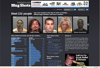
This multimedia effort is so successful, and yet it's so ethically questionable. The St. Petersburg Times' online staff of Tampabay.com, created a website with a computer program that searches and compiles the mugshots of everyone arrested and booked in the Tampa Bay area's four counties: Pinellas, Hillsborough, Manatee and Pasco.


The completely automated computer program searches the database of each county's sheriff's website and puts up the profiles of those arrested in the last 24 hours. The data is also broken down by gender, height, weight, age, and eye color. Crime articles and videos also populate the site.

The site says it is a public service website that helps those to search and "meet" those arrested by last name and zip code.

The Poynter Institute held an online chat with the programmer behind this site, Matt Waite. They discussed some big ethical concerns. (Scroll down to the online chat transcript.)

In the chat, the public had a concern with Google's ability to pick up these mug shots. Waite insisted that they took pains to keep Google away from this site. And also, after 60 days, the photos of these individuals would be flushed out from the site. Except, the records of one county goes back to 1995.

From a multimedia standpoint, this website is VERY successful. The individual county sheriff's sites have very old-fashioned, boring looking designs. Also, nothing is streamlined. One county's "arrests inquiry" is the same as another's "who is in jail" section.

Also, I can't help but look at the faces of these people. Waite says that only those files with mugshots get to be placed on the site.

However, from an ethical standpoint, these people are being wrongfully associated with crime in these four counties. Just because they are arrested, it does not mean they are guilty. The site states this fact in its "about us" section. However, I can't help but wonder how many people would look at these mugshots and NOT think: CRIMINAL.

Also, the statistics of gender, age, height create a visual representation: it gives the impression that these statistics are representative of ALL those arrested in the four counties. However, that is false. Some individuals with faulty mugshots or no image are NOT placed on the website.

Waite says in the Poynter chat that this project was spawned from his paper noticing that there was more online traffic on crime stories containing a mugshot.

There's a "Facebook" feel to the website. It's very visually clean and modern. However, to me, it's not a public service. To me, the site feeds on the public's curiosity and facination with the mugshots.

Wednesday, June 3, 2009

Daily Kos: State of the Nation

I dug through this website and think it's what it claims it to be, a Democratic space for the online public to write about what they care about in politics.

I also was impressed with this Electoral Scoreboard. But it took awhile to dig through to find it.

Here's what I don't like about it:

1. There's so much going on in the design that it's hard to focus on one blog entry.

2. The FAQ section is a wiki-based page. Does that mean everyone and anyone can update/alter the descriptions?

3. I'm not clear how any one blog gets to be the "top posting" on the website. Is it driven by the most recently added post? Or is there some other sort of method to it?


PoliticalCartoons.com

I like this website because it's smart, witty and current to the political stories of the day. I appreciate that there are different cartoon artists represented on the site.


But, I am not sure how to verify that these cartoon artists are the "best" in the world, as the site claims. However, it's pretty clear that the site is good for political entertainment and for purchasing the cartoons.

Of course, you have to be up-to-date with the political stories of the day to really appreciate the humor. I think that's what separates a political cartoon from an every-day cartoon.

It's clear that the website is trying to make a profit from selling these political cartoons.
I think the privacy policy is pretty transparent. But unfortunately, many people may not notice to read this "fine print." Here are some key aspects on how the site uses visitor information:

"For each visitor to our Web page, our Web server automatically recognizes only the consumer's domain name, but not the e-mail address (where possible)."


"With respect to Ad Servers: To try and bring you offers that are of interest to you, we have relationships with other companies that we allow to place ads on our Web pages. As a result of your visit to our site, ad server companies may collect information such as your domain type, your IP address and clickstream information."

Do you feel comfortable visiting this site after reading the above statements?


Thursday, May 28, 2009

It's Already Here


Everyone talks about the future of broadcast news, but I think I've seen it already. It's niche-oriented, it's digital, it's funded by an organization that cares about the niche topic--- Clean Energy.

But is it independent? I have no idea.

But I met the producer of this online TV network. Executive Producer Anna Davalos says she produces daily newscasts with her staff in an office in downtown DC. Davalos has a wealth of broadcast news producing background. Now's she's moved onto this online broadcast network.

The news anchors are all experienced TV news folk. That 's a good thing. They have the look of TV news. But as for news substance, I hope it is as independent from the CleanSkies Foundation as Davalos claims.

Here is the foundation. I tried to find out what they were about but it only gives a list of people and their titles.

But this website adds more muscle to the claim that the movement of online-video has reached a tipping point, according to Paul Sagan, the CEO of Akamai, the online video streaming company.

Monday, May 25, 2009

Loving These Multimedia Websites


I enjoy these multimedia websites because they are fun, organized, and easy-to-use.

1. Feast Your Eyes On This!

If I had a website, I would model it after this one! I LOVE the music. It totally gives the ambience/vibe/mood of the personal chef. The music makes me feel that she's sophisticated like a nice, intimate high-end restaurant. And because I like the music so much, I am inclined to spend more time exploring the site. Also, I am happy that the music can be stopped at any time, just in case a visitor doesn't want the music on.


Her Recipes page is interactive/fun and visual. You click on the recipe box and the individual recipe page "pops out." I think the images are beautiful, neat, and clean. I actually contacted the personal chef, Tianna Feaster, to ask who built her website. I got the name of the guy and saw that he is an extremely creative online website builder. It seems he not only knows the technical stuff, but he also knows web design and visuals. This is why I love this website.


I also like the highly personalized language used with the site. Instead of just "contact" or the usual words, she uses "hit me up!" as her label for the "contact" page. I can read her personality through these choice of words.


The ONE caveat: Before you get into the main web page, there is a page that specifies what types of software and computer would be required/best suited to view the site. This may be the extra step you have to take with such a highly designed website.

Required:
-Java Enabled
-Flash Player Plugin

Best viewed with:

-High Screen resolution
-Broadband Connection
-Speakers
-Internet Explorer 7.0
-Firefox 2.0


2. The Wall Street Journal video section

I enjoy this news website's video player the BEST out of all the other news video players. I like how the video window is a reasonably large size. (The Pop-out video size is also fairly reasonable. But I don't use the pop-out video size that much.)

I would LOVE for the video player to be even bigger like on Youtube, but compared to other news video sites, this is a really good one. The resolution is also pretty good. Also, the video player doesn't DRAG or have glitches from the times I've visited the site.

I usually HATE the video commercials. But somehow, I don't mind the ones on the Wall Street Journal video player. I think it's because these web video commercials are highly produced and creative with really good MUSIC. Again, I come back to music because that's what draws me in. Visuals are great but you can't deny noticing the sounds.


Also, it's clever that between videos, the player displays a 5 second "The Wall Street Journal" mini-ad. It's just a simple piano tune along with the words, "The Wall Street Journal" pieced together from white scattered white puzzle-like pieces. The repetition of this tune and the ad is very effective between news pieces. (I can't get the tune out of my head.)

The enjoy browsing through the video clips. There's an eclectic mix of news topics all put at the bottom of the video screen. Also, I like the video title and concise news caption for each video.

I work in TV news. So I think the Wall Street Journal video reporters often lack the energy in their voices. This is one thing I wish they would do better--- sound more enthusiastic.

3. Google.com


I use Google's search page every time I go on the internet. I appreciate that despite all of the multimedia features that Google has developed (images, video, maps, shopping,) the search page remains relatively simple and clutter-free. I am a HUGE fan of this minimalist style and hopes it remains this way.